In
Lesson 2 of Getting Down with HTML we learned that HTML elements are
divided into block-level elements and inline elements. Elements
in each group have their display property set to block or
inline respectively. These default display properties can be
overridden with CSS, as we will see in the exercises.
The following table describes the two display properties we just discussed and two more we will explore in the exercises.
| Value | Description |
|---|---|
| inline | Only uses enough width for content. Does not generate line breaks. |
| block | Occupies full available width. Breaks the line before and after the element. |
| inline-block | Lines ups like an inline element, but allows width and height properties. |
| none | No box will be generated. Nothing will be rendered in the browser. |
A subset of more speciailized properties are visibility properties. These properties also determine how (or if at all) an element appears on the screen.
| Value | Description |
|---|---|
| visible | The default value of visibility. The element appears as normal. |
| hidden | The element is not visible. A box will still be generated but nothing will be rendered in the space. |
| Value | Description |
|---|---|
| static | Default position value. Not positioned in any special way. |
| relative | Combined with top, bottom, left,
and right properties. Element is moved from where it was but
other content does move into the emptied space.
|
| fixed | Like relative, fixed is combined with
top, bottom, left,
and right properties. Element is positioned relative to the
viewport (the browser window). Won't move when a page is scrolled. |
| absolute | Behaves like fixed except it is positioned relative to its
nearest positioned ancestor instead of the viewport. If element has no
positioned ancestors, it uses the document body, and will scroll along with
the page. |
| Property | Description | Values |
|---|---|---|
| float | Changes the normal flow of block disply elements causing other positioned elements to flow around the floated element to its left or right. | left, right, none, inherit |
| clear | Removes floating behavior from previously floated elements. | left, right, both, none, inherit |
CSS grid layout is what we've been waiting for in layout technology since HTML and CSS first appeared. Support for it began in most major browsers in Fall of 2017. While it is too powerful, and thus too complicated to provide more than a brief introduction here, you should use the resources in the Where to Go From Here lesson to explore grid further.
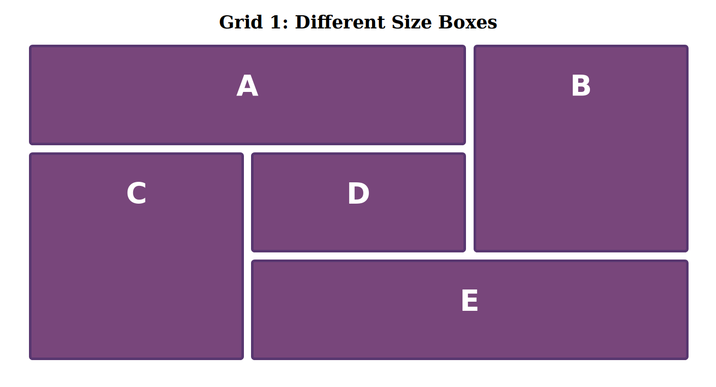
The following html:
<section id="gridexample">
<h2>Simple Grid Demo</h2>
<main>
<div>A</div>
<div>B</div>
<div>C</div>
<div>D</div>
<div>E</div>
<div>F</div>
</main>
</section>
Combined with the following CSS in style element:
section#gridexample > h2 {
    text-align: center;
    font-size: 2.5vw;
}
section#gridexample > main {
    margin-left: 3.5vw;
    margin-right: 3.5vw;
    display: grid;
    grid-template-columns: 30vw 30vw 30vw;
    grid-template-rows: auto;
    grid-gap: 1vw;
}
section#gridexample > main  > div {
    text-align: center;
    background-color: #78467B;
    border: 5px solid #583770;
    color: #FFF;
    border-radius: 0.5vw;
    padding: 3vw;
    font-size: 4vw;
    font-weight: bold;
    font-family: sans-serif;
}
will produce the following:
Additional examples of grid layout are given in the exercises that follow.
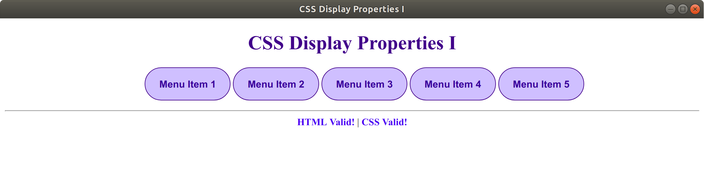
style element, immediately following the h1
style:
ul {
    text-align: center;
}
li {
    display: inline;
}
What happened after you applied each? How would you describe the
difference in the appearance after you changed the display type?li elements and set their
width and height:
li {
    display: inline;
    border: 0.1vw dotted #555;
    width: 12vw;
    height: 4vw;
}
What do you see? Change the display value from
inline to block, inline-block,
and none, reloading your page each time and making note of
the changes.div#box2 style
already in the style sheet:
display: none;Reload the page and note how it looks.
display: none with
visibility: hidden. Again, reload the page and note how it
looks.hidden value to visible.
Reload for the last time, and take notice of what changed.@import statement:
div#container {
    position: relative;
    top: 20px;
    left: -40px;
}
/* before
it and */ after it), and then add the following in its place:
div#box_1 {
    position: absolute;
    top: 210px;
    left: 210px;
}
absolute with fixed. See if
anything changed. Hint: Try scrolling up and down the page.
div#before {
    float: right;
    top: 210px;
    left: 210px;
}
Refresh the page, what change occured? Now, replace the float
value with left and then inherit, reloading each
time to see what changed.
h1 {
    text-align: center;
    font-size: 2.5vw;
}
main {
    margin-left: 3.5vw;
    margin-right: 3.5vw;
    display: grid;
    grid-template-columns: 30vw 30vw 30vw;
    grid-template-rows: 14vw 14vw 14vw;
    grid-gap: 1vw;
}
This creates a grid with three columns and three rows.
.box {
    text-align: center;
    background-color: #78467B;
    border: 5px solid #583770;
    color: #FFF;
    border-radius: 0.5vw;
    padding: 3vw;
    font-size: 4vw;
    font-weight: bold;
    font-family: sans-serif;
}
grid-area property to position each div so the
page looks like this.
The value of grid-area is four numbers seperated by slashes
(/) that describe the upper left and lower right
coordinates of the element within the grid. The a and
e boxes should be positioned with the following. See if
you can position the rest of the boxes yourself.
.a {
    grid-area: 1 / 1 / 2 / 3;
}
.e {
    grid-area: 3 / 2 / 4 / 4;
}
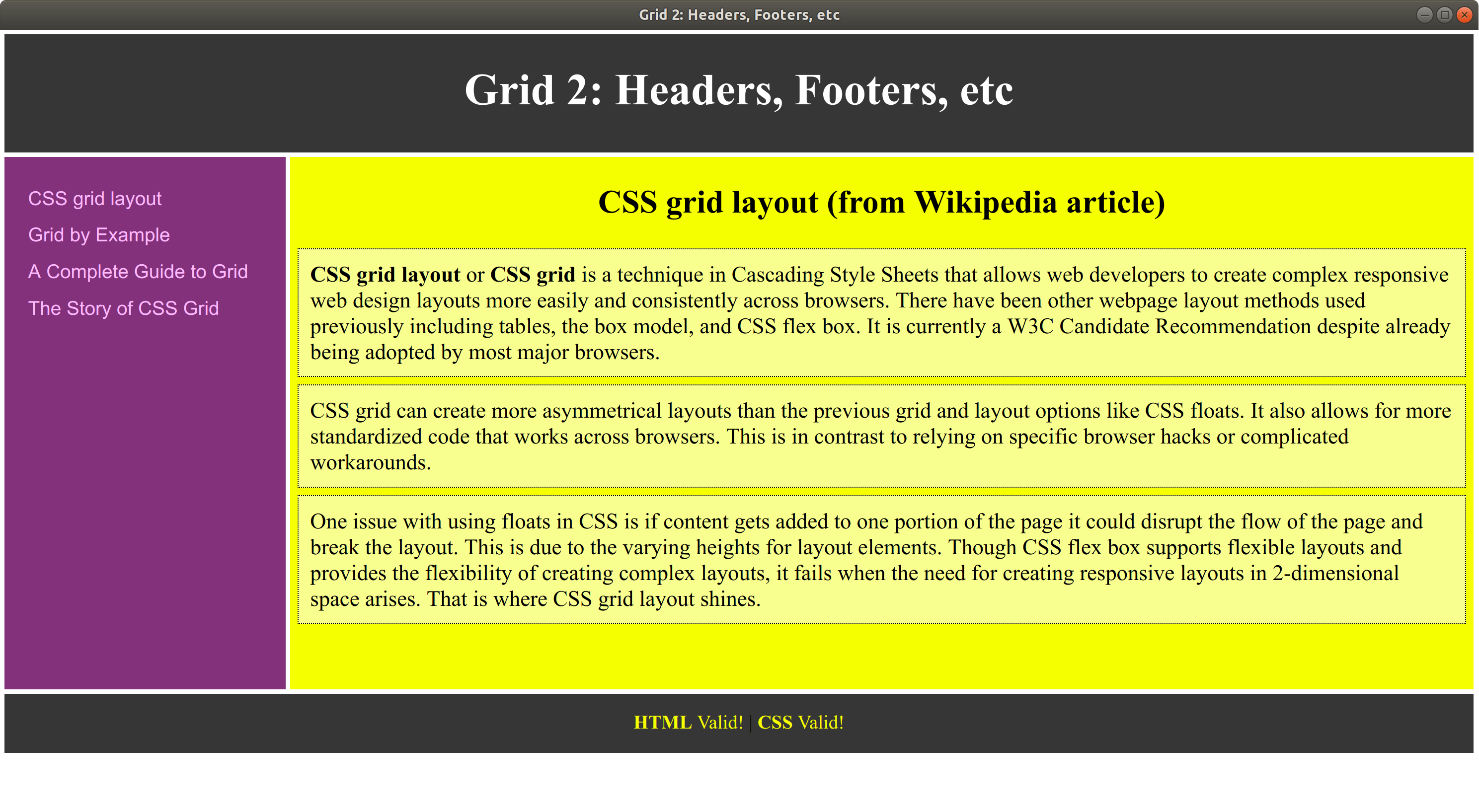
body {
    display: grid;
    grid-template-columns: 19vw 80vw;
    grid-template-rows: 8vw 36vw 4vw;
    grid-gap: 0.3vw;
    margin: 0.3vw;
}
header {
    grid-area: 1 / 1 / 2 / 3;
    background-color: #333;
}
header > h1 {
    color: #FFF;
    text-align: center;
    font-size: 3vw;
}
nav {
    grid-area: 2 / 1 / 3 / 2;
    background-color: #78467B;
    padding-top: 1.6vw;
    padding-left: 1.6vw;
}
nav > a {
    display: block;
    margin-top: 0.5vw;
}
nav > a, nav > a:visited {
    font-family: sans-serif;
    font-size: 1.3vw;
    color: #FCF;
    text-decoration: none;
}
nav > a + a {
    margin-top: 1vw;
}
main {
    grid-area: 2 / 2 / 3 / 3;
    background-color: #FF0;
}
main > h2 {
    text-align: center;
    font-size: 2.2vw;
}
main > p {
     background-color: #FF9;
     margin: 0.5vw;
     border: 1px dotted #000;
     padding: 0.8vw;
     font-size: 1.5vw;
}